This article first appeared on ALM Consulting magazine. View the original article here.
As companies across all sectors have invested massive amounts of capital in the collection and evaluation of data and analytics over the past decade, clear and coherent data visualization has become increasingly important.
“Graphics raise questions that stimulate research and suggest ideas,” wrote statistician Antony Unwin in a 2020 article for the Harvard Data Science Review. “Graphics reveal data features that statistics and models may miss: unusual distributions, local patterns, clustering’s, gaps, missing values, evidence of rounding or heaping, implicit boundaries, outliers and so on.”
The importance of strong data visualization became tangible to millions during the Covid-19 pandemic, as people around the world sought to understand the mechanisms of infection, assessed case figures and obsessed over curve flattening – or, as one reportedly data-averse former head of state put it, sombrero squashing. Today, data viz fans are numerous enough that dedicated newsletters have been established to report on the topic.
The Right and Wrong Ways to Visualize Your Data

Of course, there are wrong and right ways to visualize your data. One typical error is including too many details in your graphic, says Kate, a designer who works on data visualization for consulting clients.
“Cramming too much information into a small space is a common mistake, as is using overly complicated charts that can’t be understood at a glance,” she says. Additionally, if you’re a business working with designers on visualization, Kate adds, “providing them with the right material and guidance is key.”
“It’s always useful to provide designers with the data in a native file format, with cues as to what information should be highlighted and which is less important,” she says. “This allows visual experts to think outside the box and portray the data in the most eye-catching and engaging way possible.”
Effective data visualization is especially key for consulting firms where clients rely upon accurate conveyance of multiple data points to draw out conclusions and impactful ramifications of various strategies. Focusing on the most important details and choosing the right visualization for the dataset are among the most important factors for easy comprehension.
Examples and Best Practices in Data Visualization

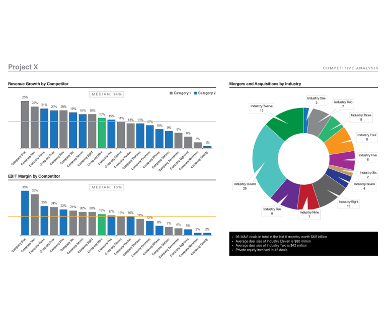
This is better illustrated with some visual examples. In this first slide, we see competitive analysis data for Project X – revenue growth and EBIT margin by competitor, as well as M&A deals by industry.
There are several opportunities to improve both the data visualization and the legibility of this slide.
Chart Type
Choosing the right visualization for your data is paramount. Pie charts can be extremely useful for comparing percentages between two or three categories, but more than four or five (at most!) dilutes the ability to effectively parse the differences in category size. Additionally, pie charts are meant to illustrate percentages of a whole – using a pie chart for data that is not a percentage is both inaccurate and ineffective. Bar charts are perhaps the most commonly used form for simple data visualization, but choosing the right kind of bar chart is key. A large number of categories in a vertical bar chart can add visual clutter.
Color
Be purposeful with your color choices. Keep your palette neutral and use tints (or shades) of color to distinguish between categories. Reserve your primary or accent color to call attention to select categories or data points. Ask yourself “does adding color here help tell the data story?” If the answer is no, stick to the neutrals.
Details
Focus on the most important information and keep it simple. Overloading slides with too many charts, text, icons and details can make it difficult to understand. Embrace the white space and give your data room to breathe. Remove unnecessary chart details and avoid run-on sentences and tight blocks of text.

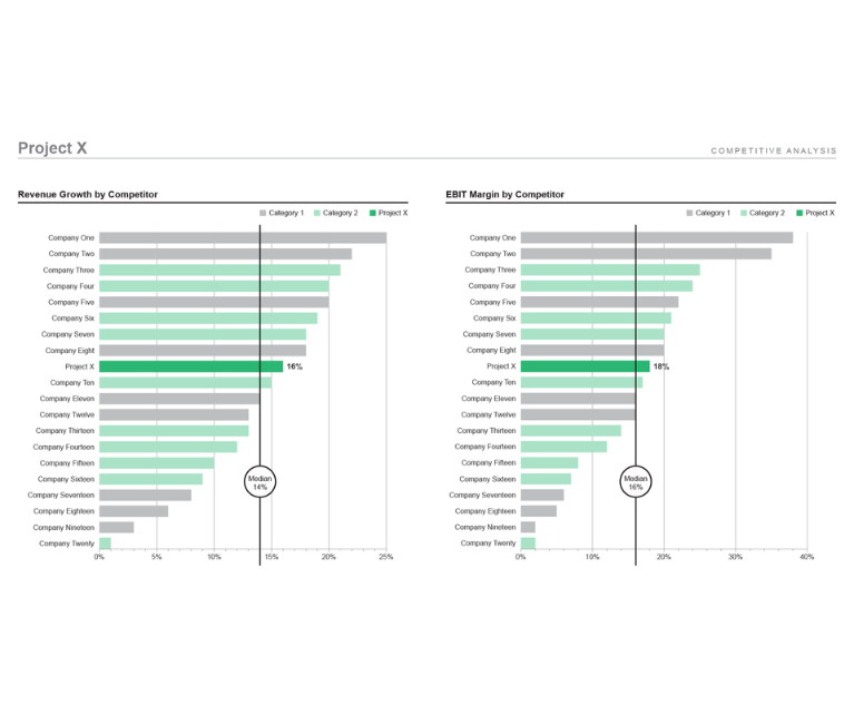
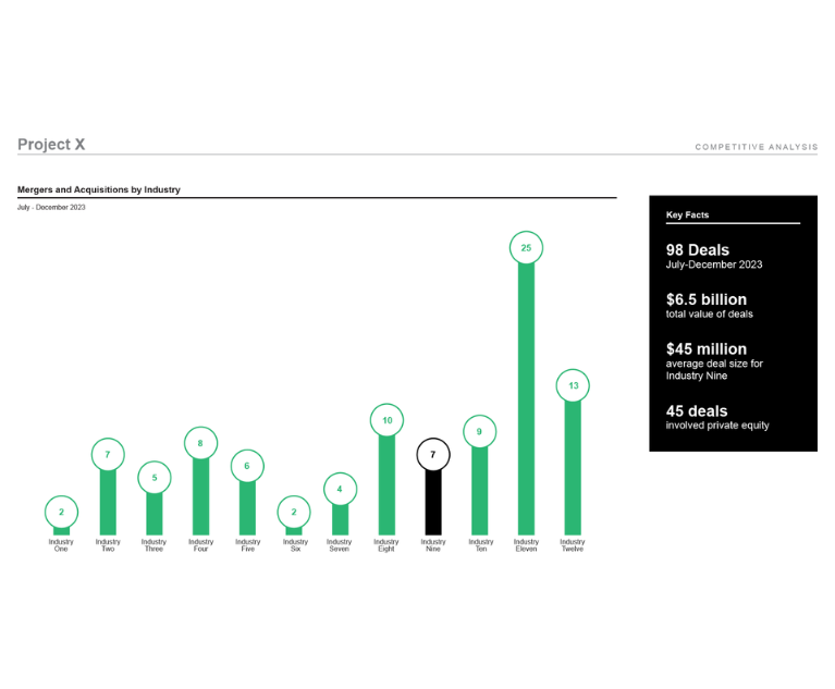
The following slides show the principles above applied to the same set of data. Vertical bar charts have been reformatted to horizontal and simplified in color. The pie chart has been moved to a new slide and visualized in a more accurate and easier to understand chart. Key facts have been enlarged and given more space and prominence.
Data is critical, but how it is shown is also vital to convey clear and insightful messages. Collaborating with visual experts, like Integreon, aids not only the production of content but the visual impact, creating ideal outcomes for consultant work.


